If you tune into what industry insiders, consultants, and designers are saying about the future of shopping, and particularly retail design, what you will now hear is words like… “experience”, “technology”, “multi-sensory”, and “play”. So what we would call novelty.
One of our favourite retail case studies is Kaufmann’s, a giant Department Store in downtown Pittsburg, USA. Now, you may not have heard of Kaufmann’s but their shop ranked as one of the 10 largest department stores on the planet throughout the 20th Century, and probably still does today. It was one of the classic luxury retail experiences of America’s Gilded Age and people flocked to it. The store claims to have been the first retailer in America to take out full page newspaper ads. Before electricity came to Smithfield Street in the 1890s, employees would take turns in the basement hand-cranking the mannequins so they would gyrate on pedestals in the store windows. What brought the crowds to Kaufmann’s was service, its flair for publicity, its alluring spaces, and elements of novelty. Like many a commercial enterprise during that period, Kaufmann’s also put great stress on cutting-edge architecture. So the tactics for success don’t seem too different to right now. What your customer sees is your brand, your store, the graphics, the point of sale and, above all, your wares. We make sure they also notice the lighting, the furniture and the ambiance.
YOUR RETAIL STORE IS NOW A WALK-IN CATALOGUE
WE NEED TO THINK ABOUT PRODUCT PRESSURE, SUSTAINABILITY AND THE UNSEEN THINGS.


1. What is your definition of Product Pressure and Visual Merchandising?
We take a simple approach to VM; Visual Merchandising is all visual strategies which increase turnover, and product pressure is the number of articles displayed per shelf metre or per square metre of sales area. VM is the instrument for distinguishing, and therefore freeing, oneself from price comparisons. The shopfittings we design are viewed as a stage for that presentation and we make them to be correspondingly flexible, movable and simple, in order to allow numerous changes without difficulty; whether a company’s VM team might be employing a “Classic Visual Merchandising” approach, in other words concepts with high product pressure, or a “Premium Visual Merchandising” approach, concepts with low product pressure like in luxury and fashion retailing. We are also very conscious of things like Customer flow, Sightlines & Focal Points, Focus on best sellers; “eye line is buy
line”, Consistency & standards, Grouping and story telling, and Space planning. Skilful linking of the new (IT technology, LED, etc.) with the tried and tested is also important for us.
2. Will your store be a Walk-in Catalogue?
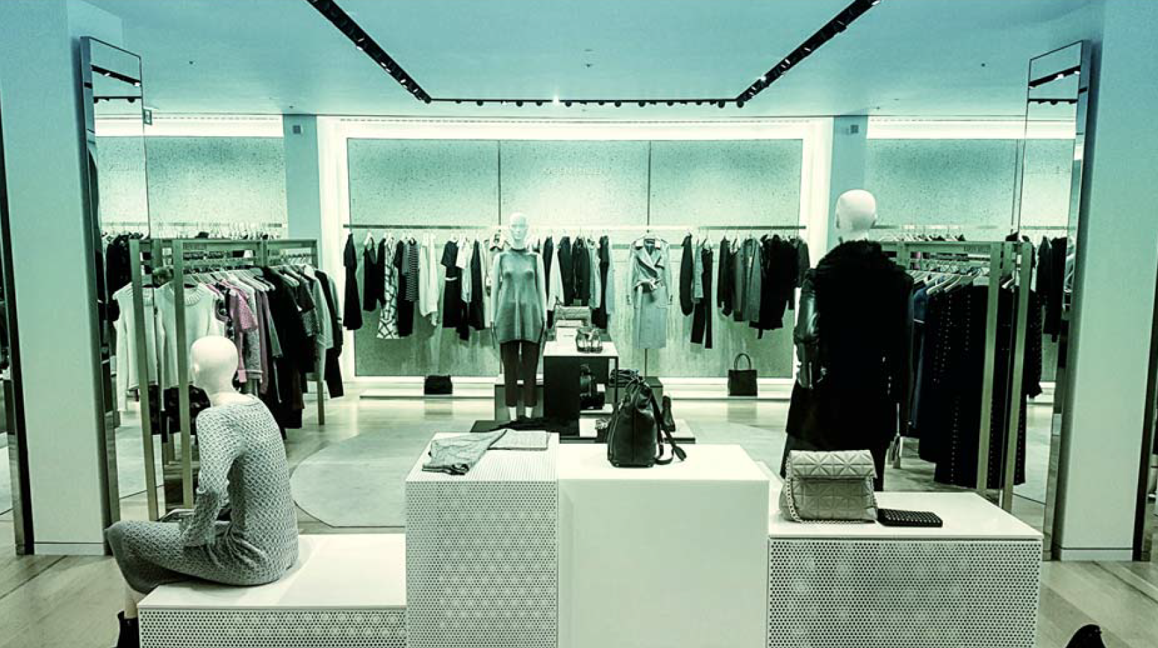
Technology is accelerating the progress of retail “set design” and presentations at a rate that no one could have predicted. Multi-channel retailing, traditional off-line approaches coupled with on-line and mobile approaches, is now a key feature of both the present and the future. The biggest brand names in the business are now creating “see-now, buy-now” collections to satisfy their consumers’ want for instant gratification. Most retailers view customer satisfaction as their decisive yardstick for their activities and therefore constantly fine-tune their presentation with this in mind. The idea of bricks-and-mortar shops as walk-in catalogues with all items available and presented attractively, with emotional appeal, is possibly the best way keep real shopping experiences relevant.
3. How to do Sustainability and Corporate Social Responsibility.
Sustainability is not just a trendy word, it forms the basis of our design process and our business. If you attend any event in retailing today there will be scarcely a corporate flyer which does not refer to “sustainable” or “ecological” or “green” but it can be hard to tell if this is merely word play. When you think about it, sustainability is simply better design and provides resilience for any business. But true sustainability starts with overall corporate social responsibility within a company and requires consideration of all aspects of the business from team members, brand partners, and customers to the community in which the company operates. There is only so much of that chain a designer can affect. But in the areas we can influence we apply a rigorous control over energy and heat loss in the building, we limit water usage in the design, and we specify materials that are healthy and not wasteful. We are also very aware of the knock-on affects of transitioning to more sustainable approaches, for example, the use of LED lighting will reduce electricity consumption but will also increase heating demands in a structure.
4. Unseen Tactics, the things that really ensure better projects
What is unseen by everyone except you and your architects/ builders, but is invaluable to the customer experience and profitability, is the future-thinking, prototyping, sampling, the value engineering of specification packages, phasing and flipping of the works, and project management. We follow a careful flow where research and auditing is carried out before we create concepts. The design, that is made in partnership with you and your team, is optimised, extra-ordinary, affordable, and can be built on time. There is one shared goal; a brilliant shop that performs brilliantly. It will be designed to attract visitors, arouse their attention, entertain them, inspire them, and thus seduce them.
This all sounds good, right? Bringing it all together and creating an architecture to frame and support these principles is the tricky part however. You can certainly apply these yourself. But, if you don’t relish the task, or, if you’re in a hurry, that’s where we come in. Just call us for a consultation and we’ll show you how to do it best.
